Creative Birds
Update: Creative Birds has a new owner Rachael — and we had the pleasure of taking photos for her too!
Tash from Creative Birds is an absolutely lovely human that creates luxe, unique wedding stationery.
Her old website was a tiny bit of a mess and she wanted to integrate an booking system to manage her orders better.
Advice session 01
We started with a massive blueplan before we started the web build.
We laid out step-by-step what a customer shoud expect and then what Tash should do in reply in a clear systematic workflow.
(We digitised it after, of course!)
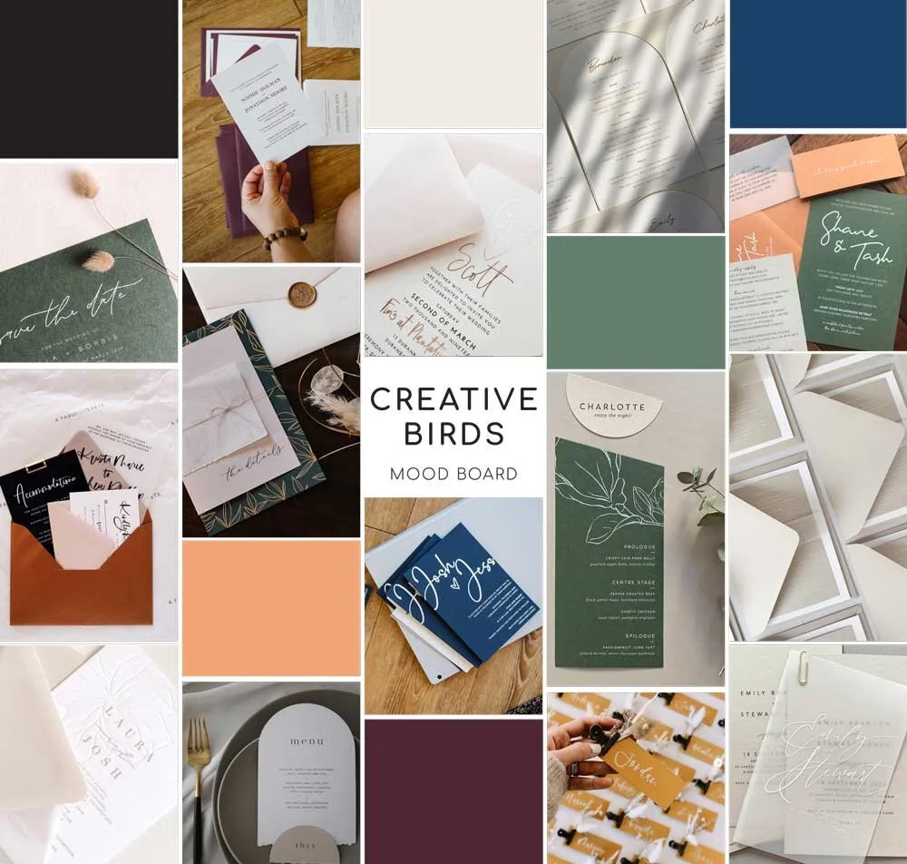
Moodboard provided by Tash at Creative Birds
User experience comes first 02
From the homepage to the inner fixed design pages, we made all call-to-actions (CTA’s) crystal clear! Clear directions makes the user experience simple - most of the CTA’s you see on the site always appeared in pairs - and simplicity converts into sales.
Here’s some CTA’s you can see on the site:
Homepage - choose between fixed or custom designs.
Inner fixed design pages - choice of booking the design or booking a consultation call.
Secondary navigation on the top right - leave a message on the contact page or book a call.
Mobile styling and clever integrations 03
Ah, more clever things!
A tonne of custom sizing for mobile so everything scaled perfectly.
Integration with a workflow system, so it was one less data entry thingamabob when new enquiries came through. (there’s three different webforms that integrate!)
We built multiple custom workflow systems (on a third party program) with checklists and semi automation to make the booking processes concise and consistent.
A custom develop widget to calculate when is the best date to order your invites (it’s 6 weeks FYI)
Photos 04
We took some photos of her products and of Tash at a headshot day!
Product shoot 05
Tash sends us some of her beautiful invites from time to time to get some beautiful styled photos done - check them out!


