Mach1 Fitness
Mach1 Fitness is a studio offers a huge range of classes - including strength and fitness programs that incorporates Pilates principles.
Before: The pain points 01
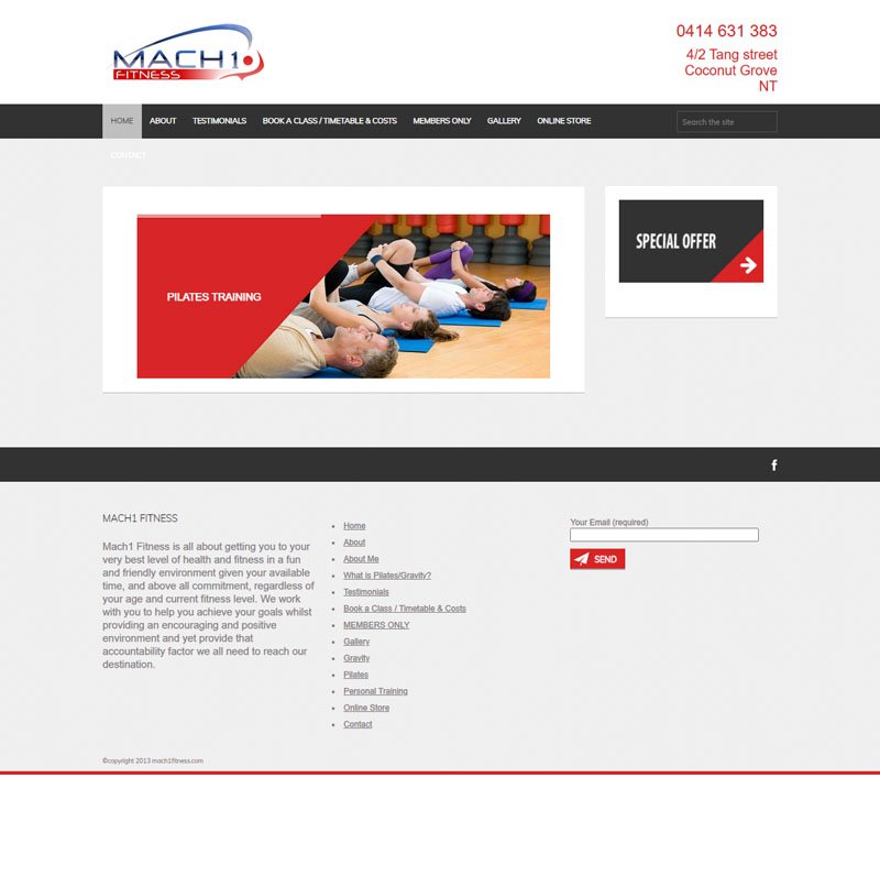
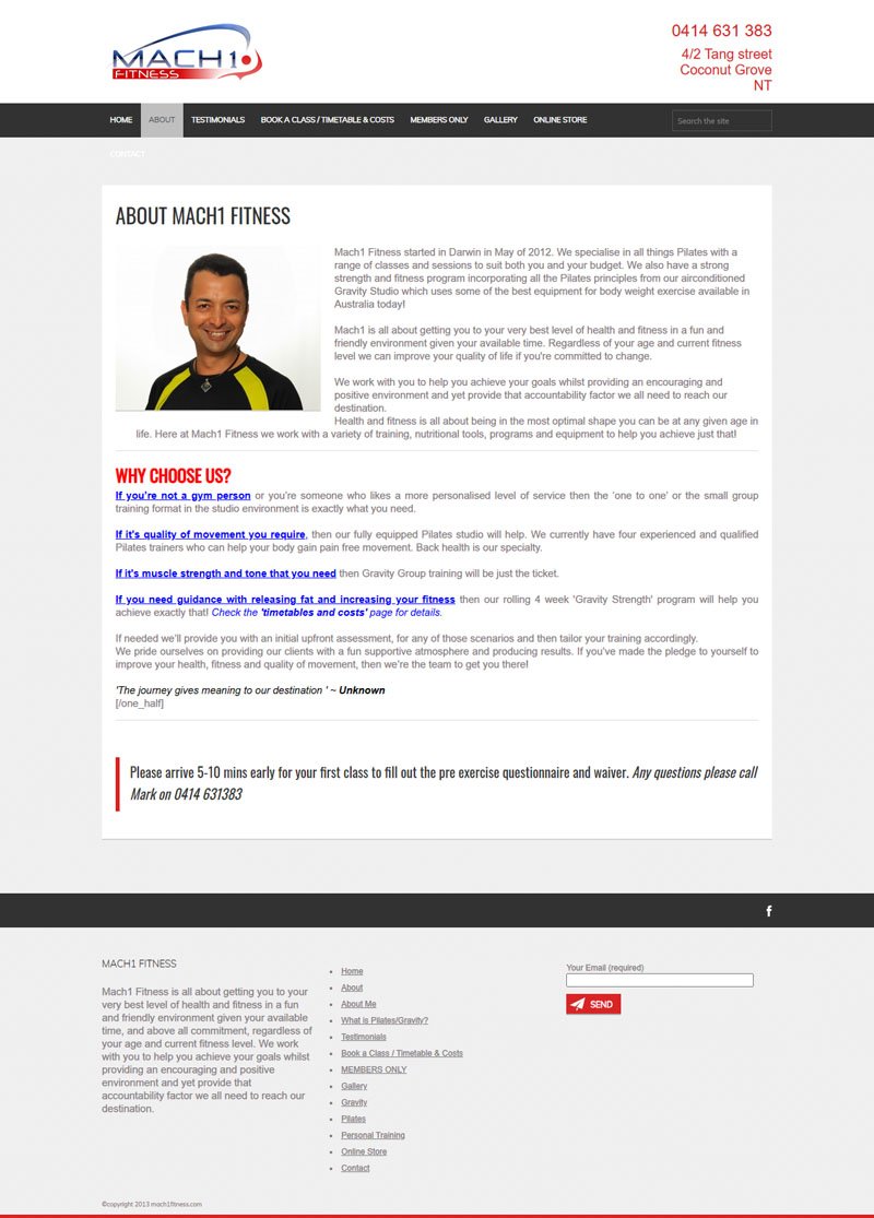
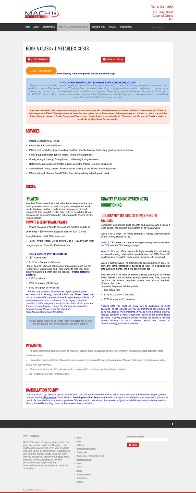
We started with an advisory session where we did some content strategy. The old website was built ages ago and wasn’t aligned to the Mach1 Fitness branding and there was just an overload of content.
Mark also found it repetitive explaining how the studio works for some of the classes. Clients would book a private class without getting an assesment done and Mark would have to backtrack and explain it in person.
Here’s some screenshots of what it looked like before:
Clarity around content 02
We worked together to categorise content to main audience streams, which was mainly the style of classes: Group classs, Semi private classes and Private classes.
This way each landing page has its own related content and it was clear about some of the pre-requirements the class needed, and details about the class itself.
We clarified the issues around the private and semi private classes by making them separate landing pages with a step by step method and making it very clear about how Mach1 Fitness functions.
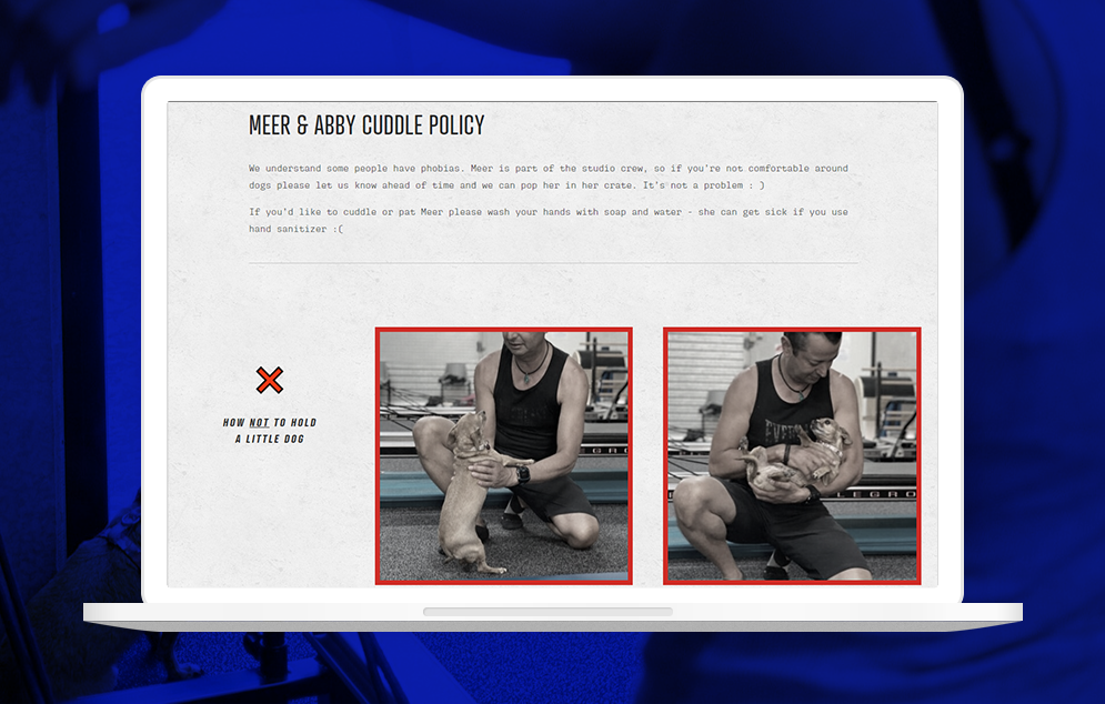
If you can, have a suss on their custom policy page! (Hint hint, there’s puppers’ policy.)
Moodboard 03
Moodboard for this project: Saturated colour overlays over black and white images, highlighting shapes in body forms, and a softer stone finish.
Branded photos for the website 04
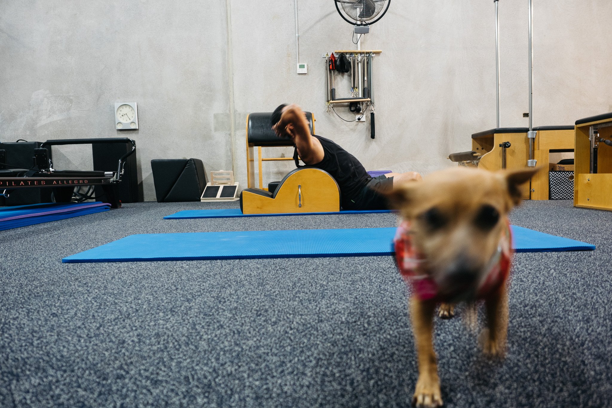
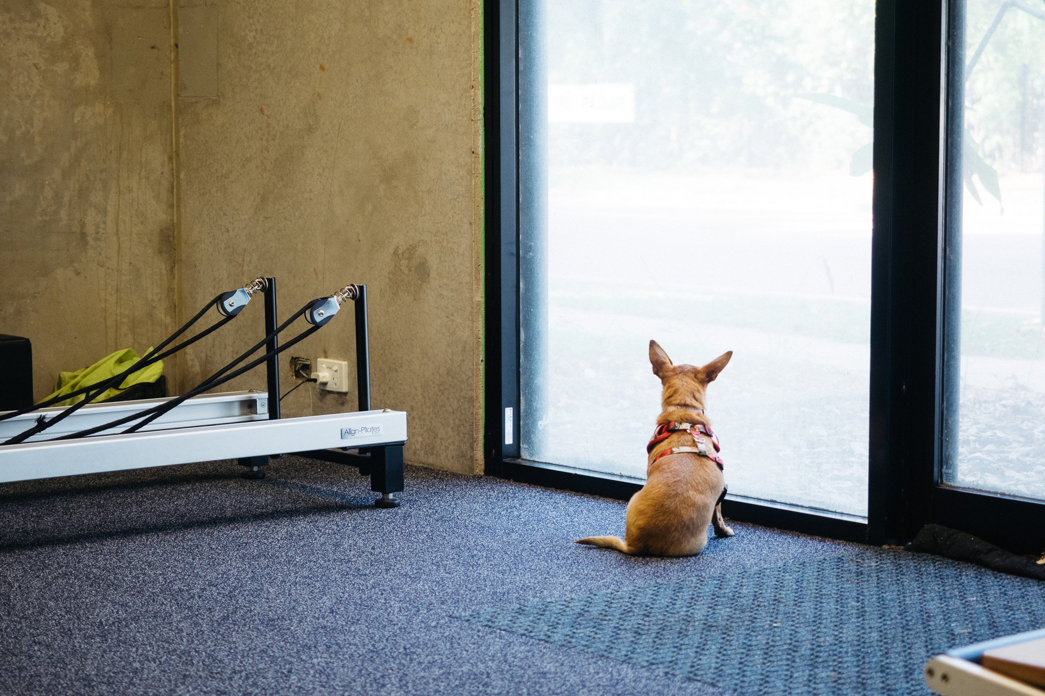
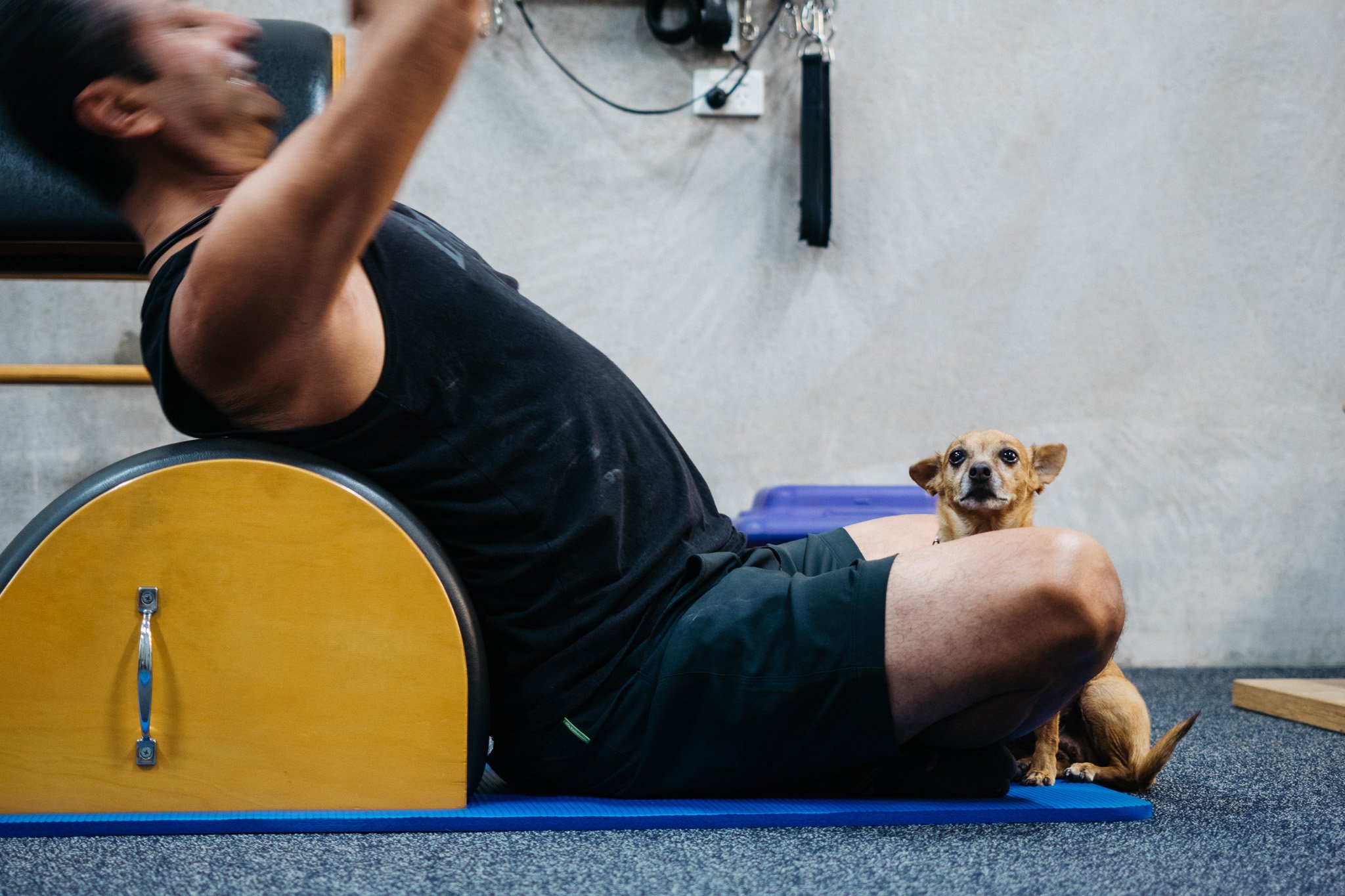
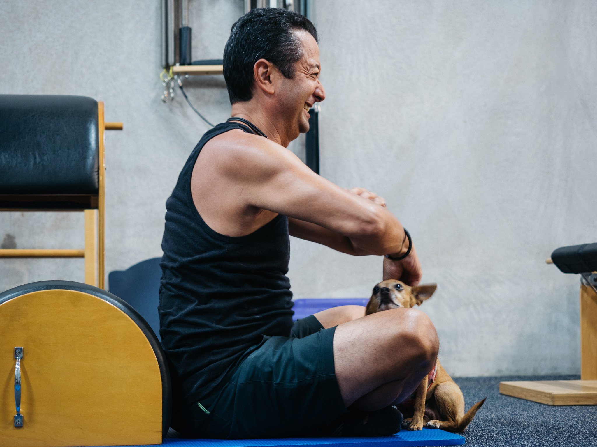
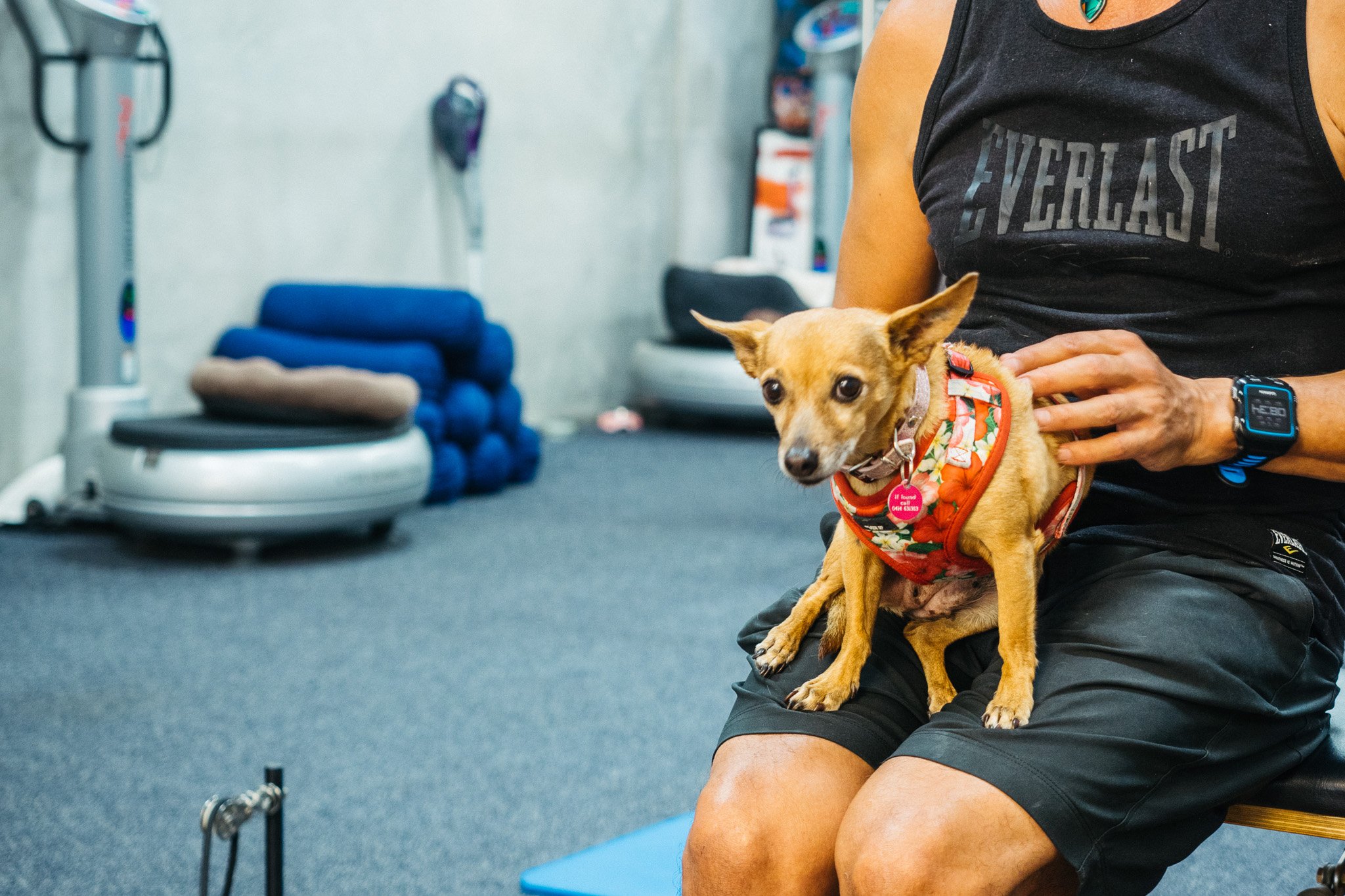
We got some new photos for the website done too, and we might have taken a bit too many photos of Meer (the studio hound)
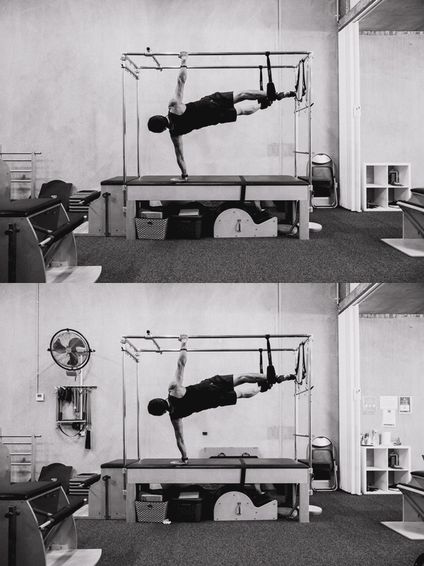
P.S. We also had to do some photoshop magik to make the homepage banner image less cluttered
Images used as banner images

