Money for Avocados
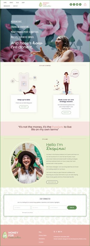
Despina’s a past client that started a new gig… She started on a DIY website on Kajabi, and decided to jump to the Squarespace boat. Money for Avocado’s branding is also cute-as-fudge (look at that logo squeeee!) and it was really fun to remake the minimalist site with some quirk.
Squarespace’s integrated stock image library Unsplash had tonnes of avo photos to pick from too!
Moving a website to Squarespace 01
Some things we tweaked were:
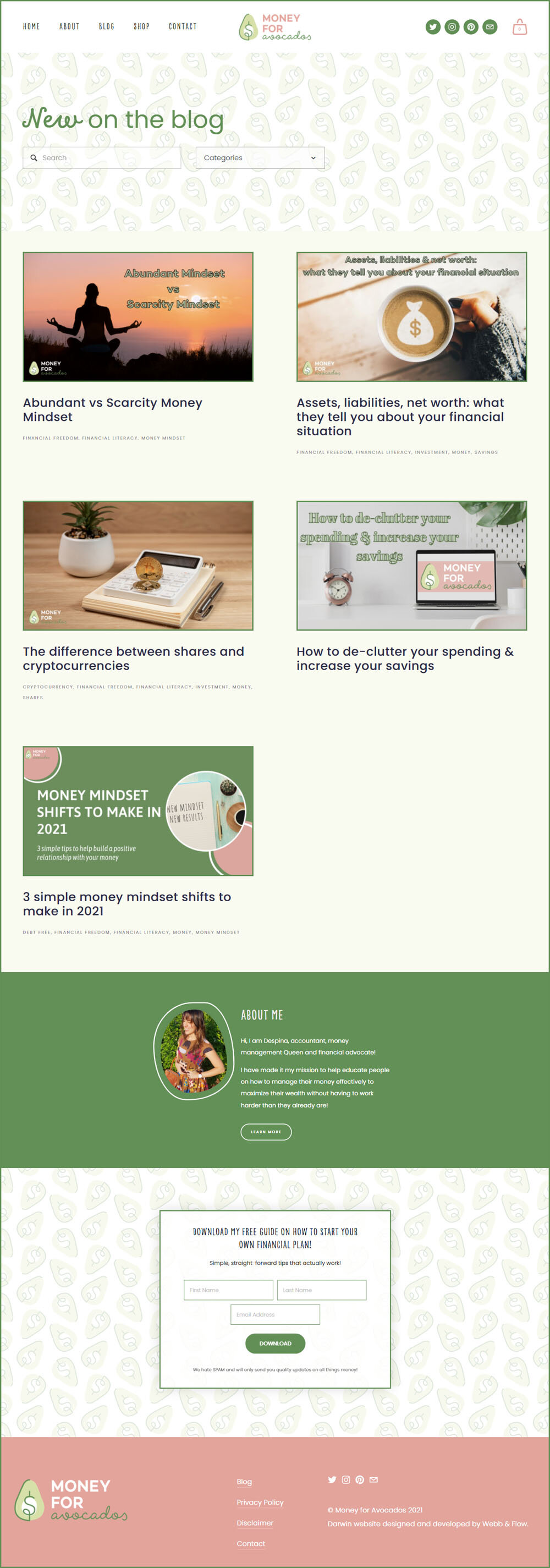
We added some more colours to the colour palette to integrate imagery and a standout CTA
Laying content with more visual breaks - like the quote
Changing up the cursive font to be just a highlight, so increase readibility and emphasis
Custom coded some avo-shaped borders to selected images of Despina
a custom seamless tile background
Additional footer sections that appear only in the blog area
Added a online shop!
Mobile styling magic
Seriously, this lady has multiple business and is a super smart cookie, check out her site!
Mobile styling
Fun branding photos 02
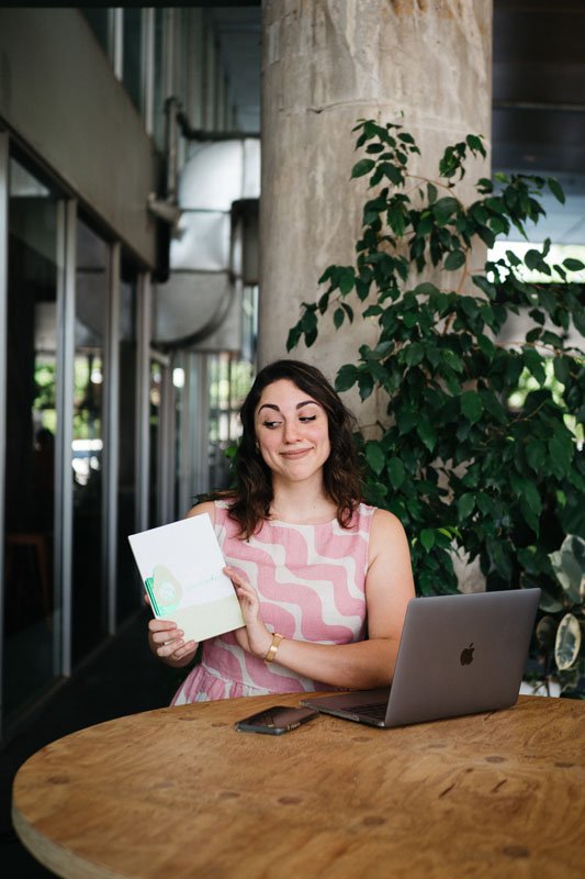
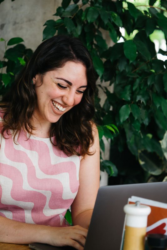
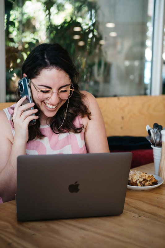
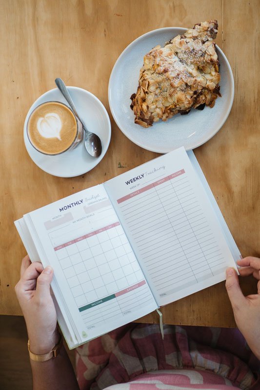
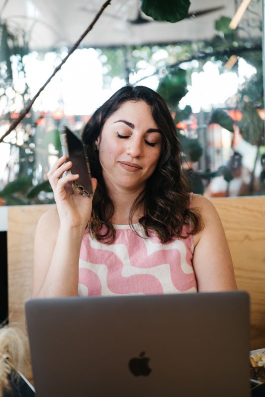
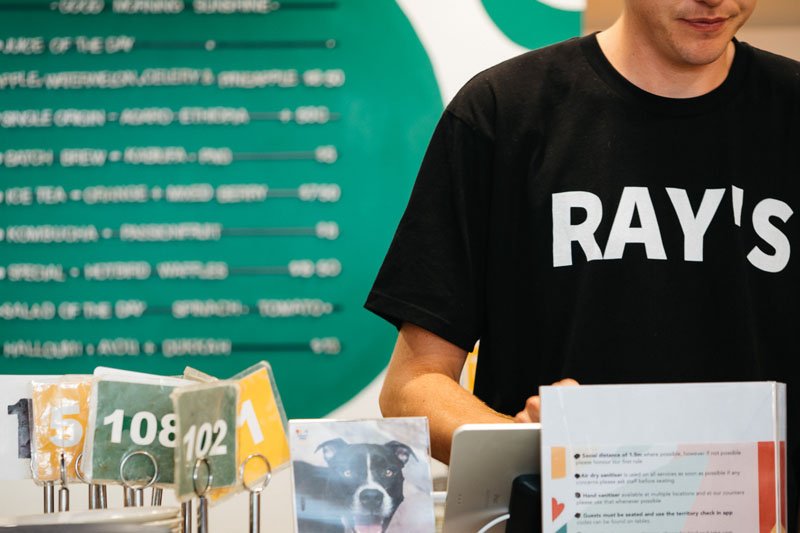
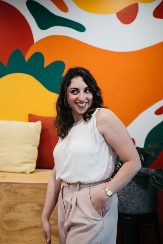
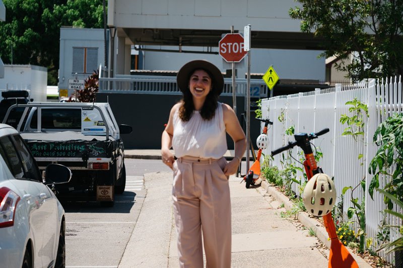
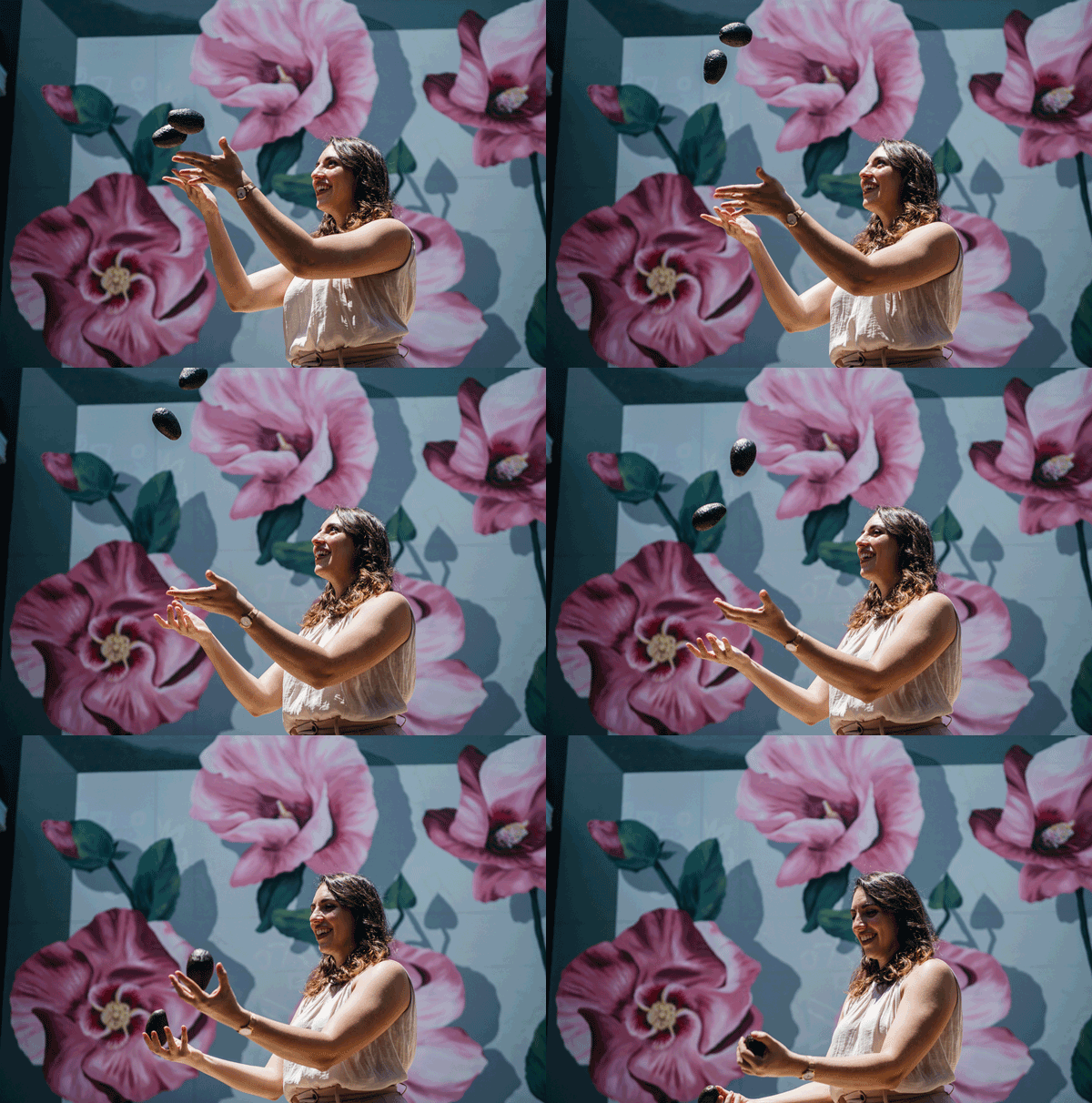
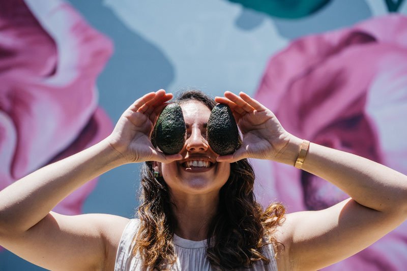
Despina ended up getting us to take some branding photos for her site and she’s started using it on her Instagram and website! Here’s some of our favourite shots from the brand shoot.. and maybe a couple of bloopers, heh.
Other businesses 03
We love a multi-business-boss-lady! We recently reworked Despina’s other business Bumble Bean Chocolates.


